Reducing 55% drop off with the redesigned basket and checkout experience focusing on 3 key customer pain points.


In the nascent days of the mobile economy, Domino's stood king of the hill with it's Online Ordering app (OLO). By 2017 the platform was showing it's age aesthetically and technologically.


The initiation of the NextGen OLO project marked a significant step towards modernising the platform. However, the unexpected surge in online orders due to the pandemic led to an expedited rollout, particularly affecting the basket and checkout functionality.


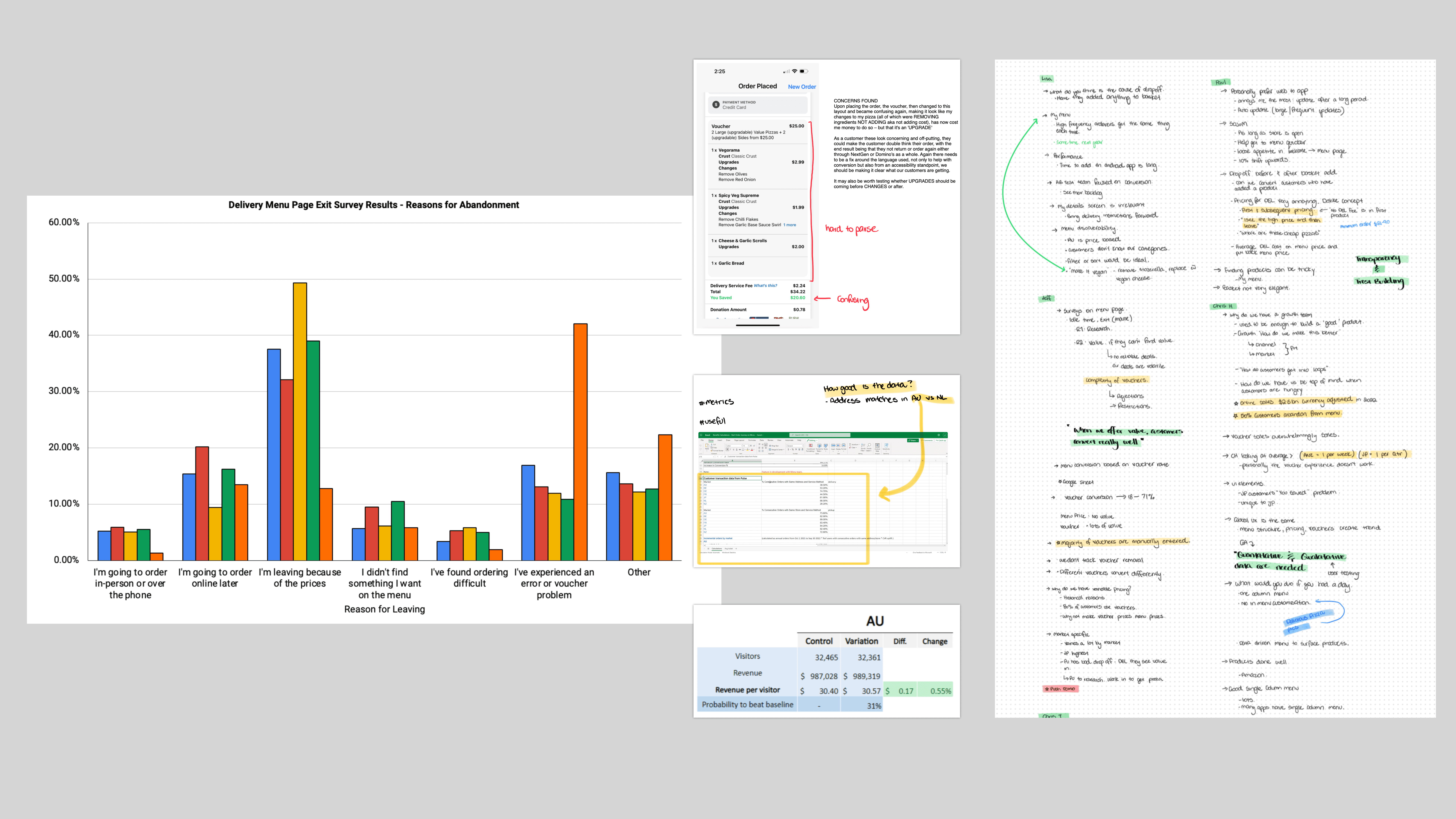
This rush resulted in a system that now experiences a concerning 55% abaondonment rate from Basket through Checkout (observed over a rolling 12-week period).

My Order Revamp

Logo

The Problem

Clarity & Presentation

Clarity &
Presentation

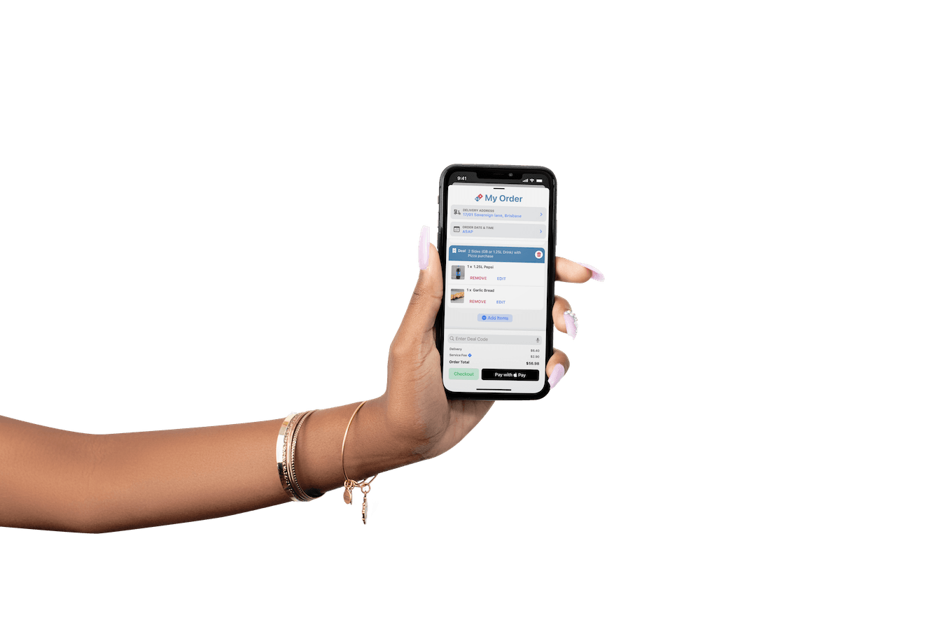
A combination of factors including rendering the Basket as a contextually separate screen and a cobbled together UI presented clarity and legibility challenges to customers that contriuted to the 55% abandonment rate.

Trust & Transparency

Trust &
Transparency

10% of the drop-off rate was associated with 'price'. Digging deeper we found Delivery Customers abandoned their basket 3x more than Pick Up – this was due to the delivery price being embedded in the cost of the first product resulting in sticker shock and high abandonment rate.

Checkout

Checkout

With advances in payment technology in the decade since launch, making customers fill check out forms was causing 10 minute (averaged) order times and the majority of the 55% drop off. Additionally, only .47% of customers change their details when presented with the option to do so.

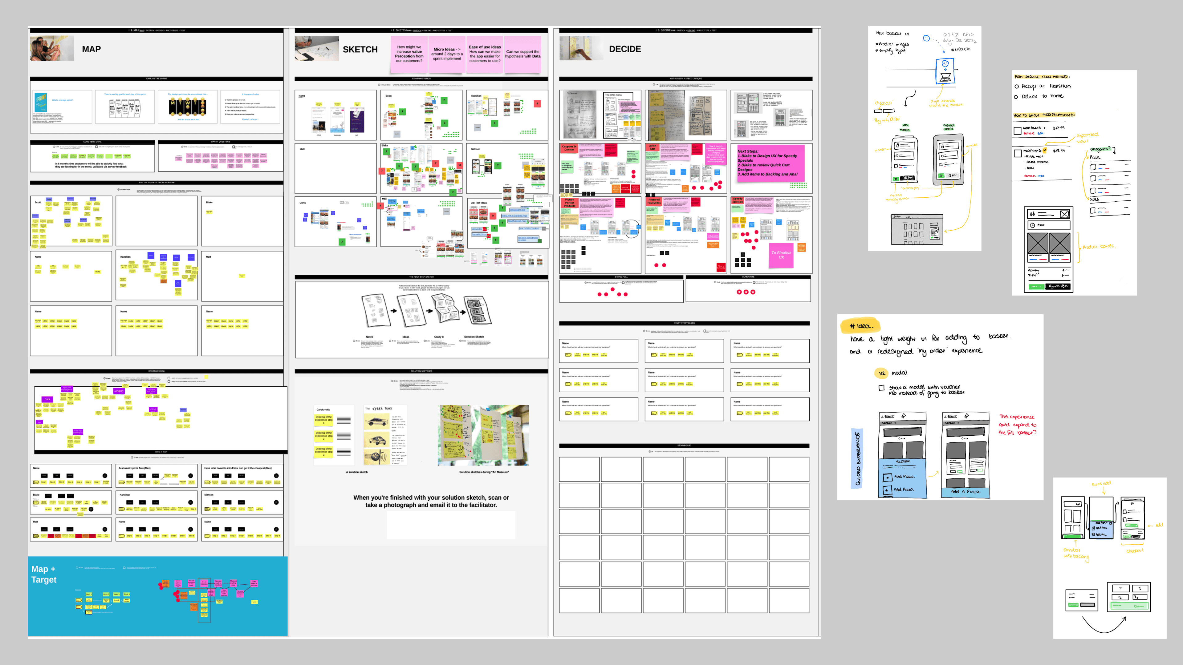
The workshop board containing each step of the Sprint phase.

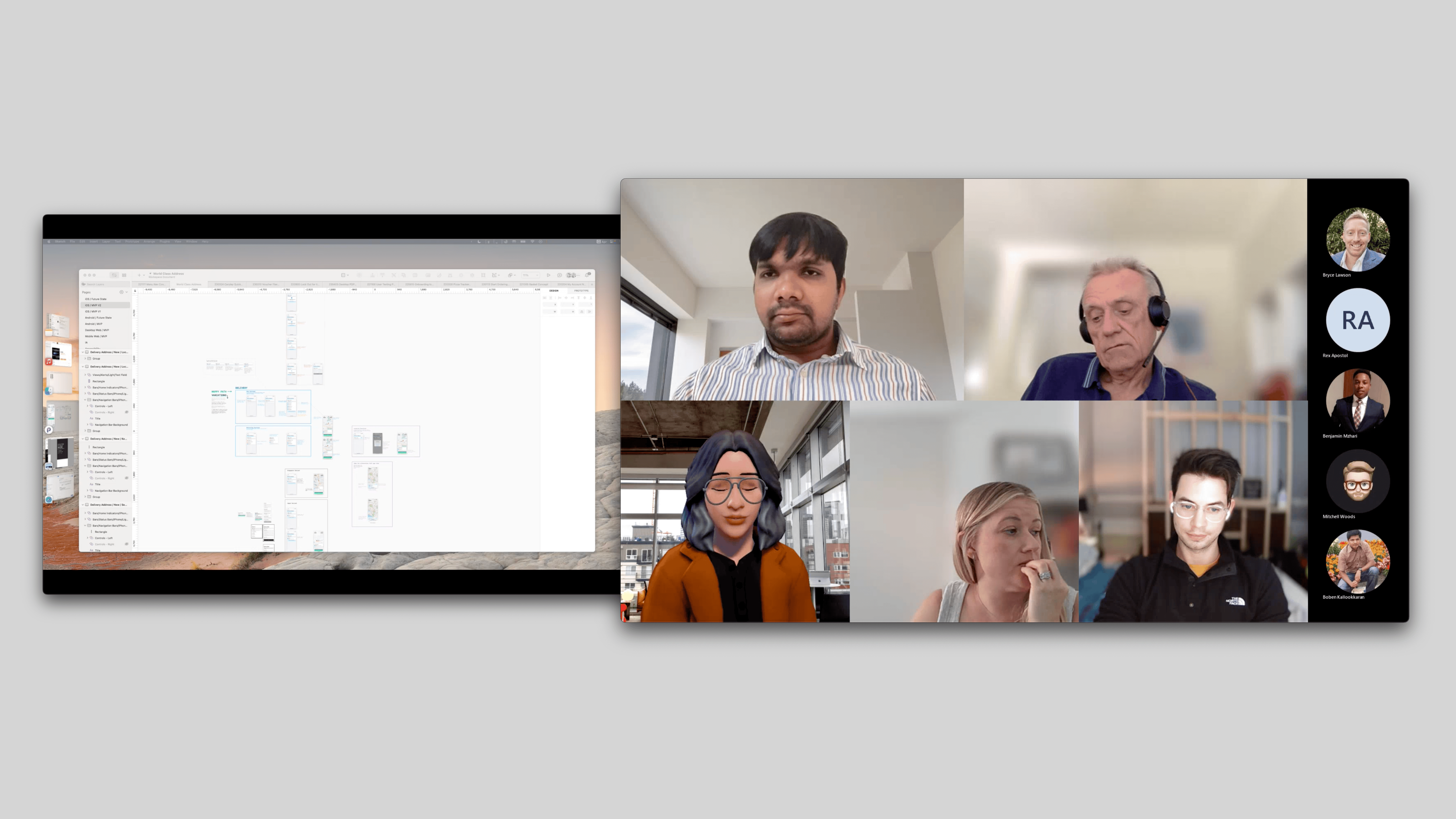
Sharing the screens with my team.

Customer behaviour data provided by SMEs for context.

A screen shot of the artboards used in designing the Basket

The Result

The Result

The insight I had was that customers are used to the tech doing the heavy lifting, and we're making it hard for them.

Smarter design can solve for this.

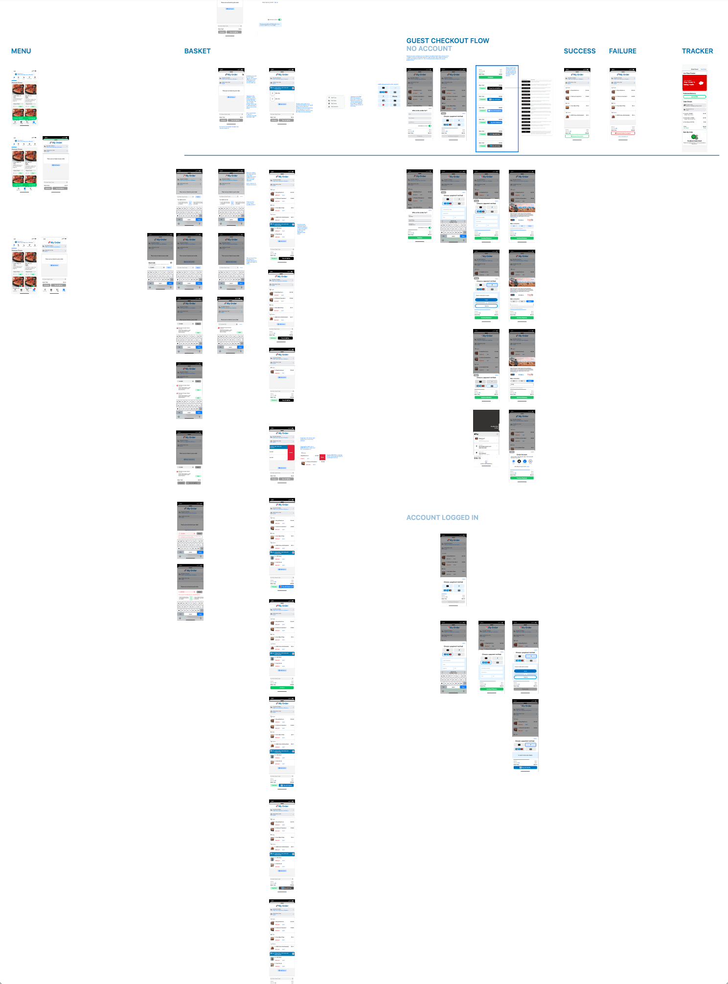
A small tiger team was convened to sprint toward a solution. Over the course of 5 days, we used the Google Design Sprint framework to align on the problem, gather data, interview subject matter experts, rapidly iterate on a solution and test an MVP in market.


As with all Domino's projects, a phased approach was planned. Phase 1 involved the rapid development of the MVP. Phase 2 resolved tech debt and laid the ground work with the back end to hot-swap the replacement product, and Phase 3 will complete the project.

Guest Checkout

Once ApplePay was rolled out, usage of the manual method for checking out plummeted. Over 90% of orders were transacted with ApplePay (on iOS and GooglePay on Android) – for folks who don't want to use another method, or if it's a friend's turn to pay the guest checkout was an important function to fall back on.


With less than 1% of users changing their my order details, including platform native auto complete functionality was vital to ensuring the smooth completion of the guest experience.

Coupon Cutting

2 out of 3 orders are completed using a coupon in Australia with 71% of those orders having their coupon code manually entered so it was important to have a good manual experience for those customers.


In particular, customers that entered an expired or invalid code and were offered a replacement coupon converted 14% higher than a bad code resulting in a dead-end error.

A screenshot showing an error with a way out for the customer

The Details

Express Pay can be tailored according to the user's needs. Providers such as Edenred and Rakuten are accessible in Europe and Asia.

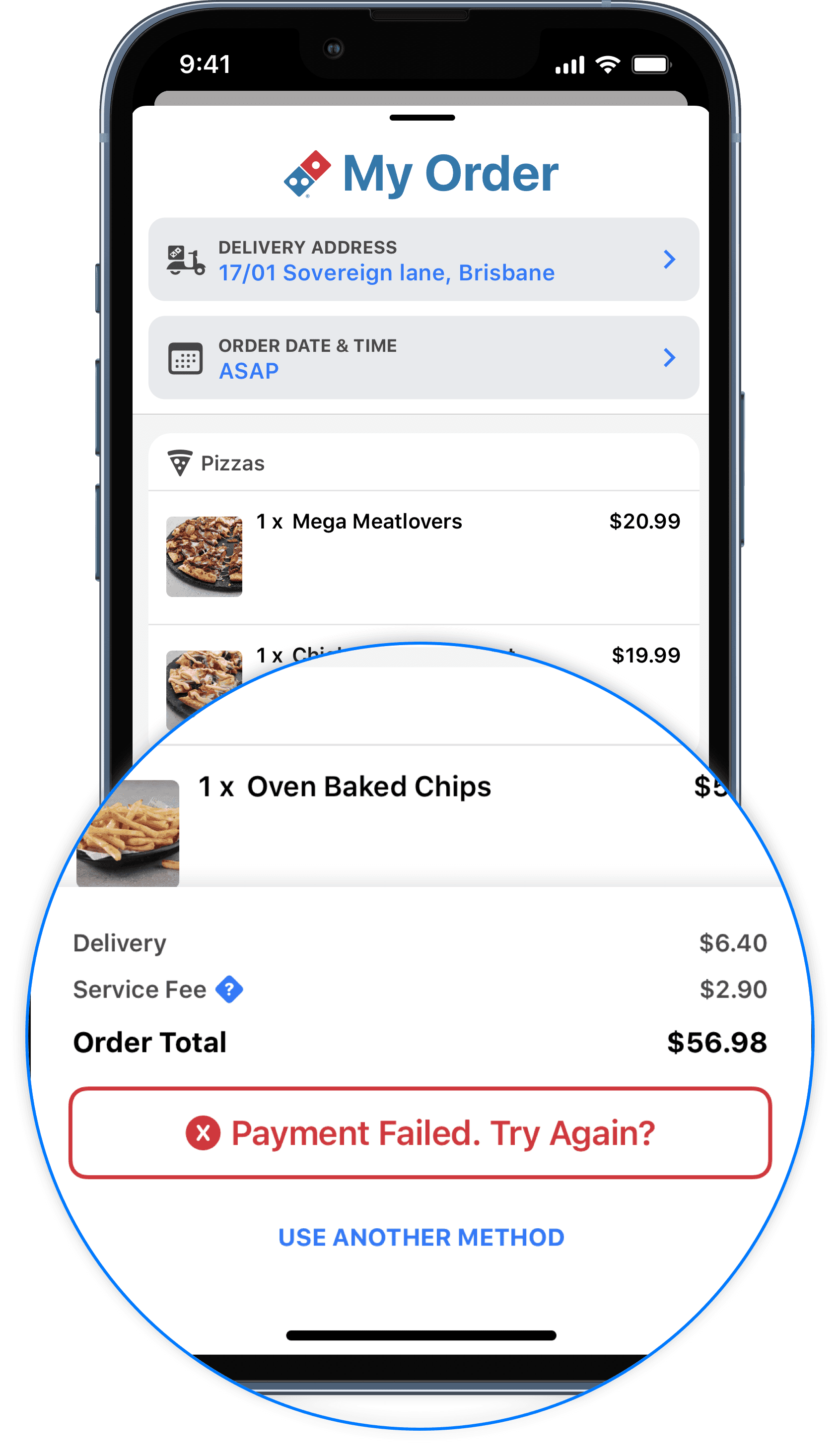
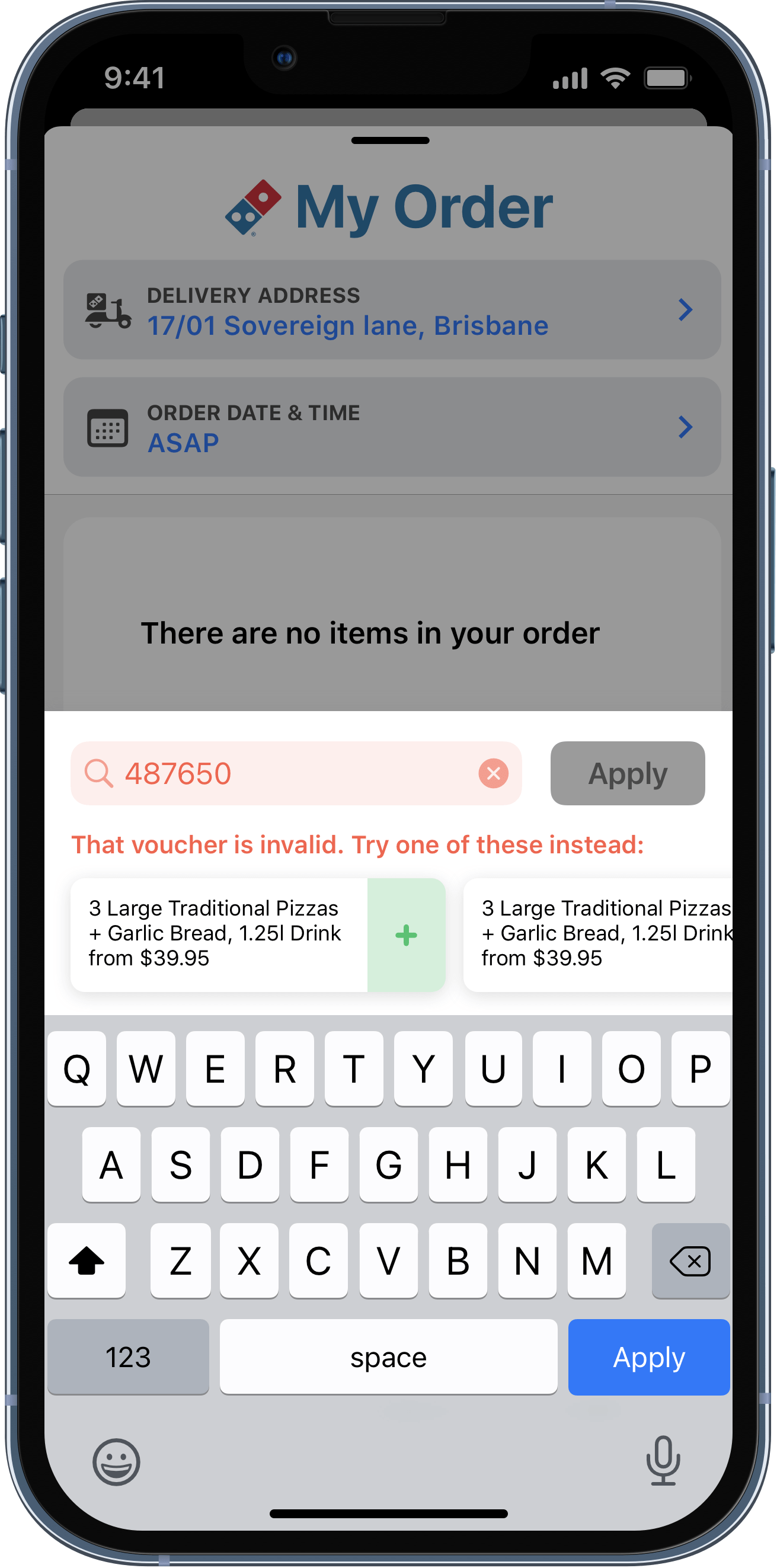
Payment failures, though rare, provide an option to try again or use another method.

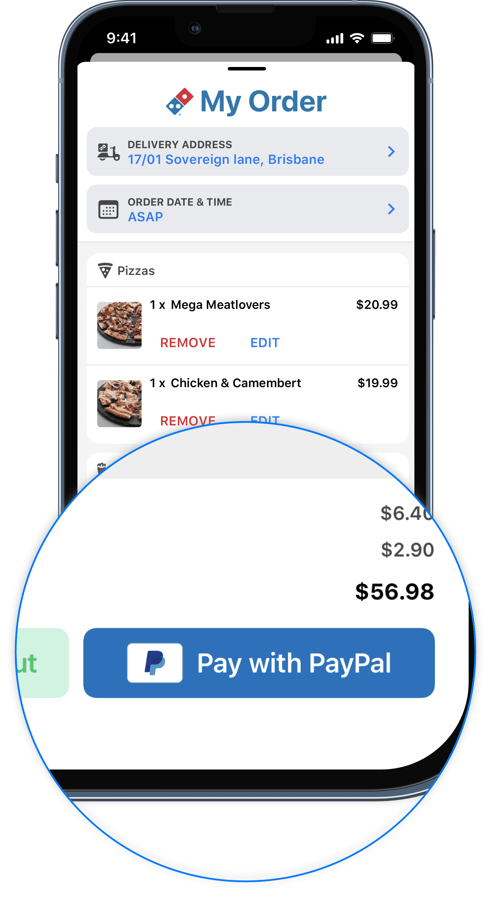
Accelerators that advanced users are accustomed to across their devices have been introduced.

The insight I had was that customers are used to the tech doing the heavy lifting, and we're making it hard for them.

Smarter design can solve for this.

Design simplicity. Transparent pricing. Hassle-free checkout process.


Enhanced user engagement via superior design.

MY ORDER

MY ORDER

Hungry for more?

Hungry for more?

Hungry for more?

Coupon Cutting

2 out of 3 orders are completed using a coupon in Australia with 71% of those orders having their coupon code manually entered so it was important to have a good manual experience for those customers.


In particular, customers that entered an expired or invalid code and were offered a replacement coupon converted 14% higher than a bad code resulting in a dead-end error.

A screenshot showing an error with a way out for the customer

MY ORDER

Design simplicity. Transparent pricing. Hassle-free checkout process.


Enhanced user engagement via superior design.